Blog

Fall 2021 Old Navy Haul

I love fall clothes. Gimme big sweaters, matching sweatsuits (swoots anyone?), and all the cozy feels. I don’t like creating a whole new wardrobe though–I like finding staple pieces and mixing in a few new items to really round out my outfit and make me feel like I could still fit in with the college students I sometimes teach ๐Ÿ˜›

So today… I present my expert opinion on fashion with a fall 2021 Old Navy haul. I know, I know. You’re totally not surprised as I roll out my first fashion post. But I love Old Navy, I think the clothes hold up for the price and I can mix them up to be casual or dressy.

The key is to mix new pieces with old favorites. It keeps your closet feeling fresh without breaking the bank. And when something stops being your favorite, you can sell it online or donate it. Please, please don’t throw perfectly good clothes in the trash โค

The goods

#1 – Oversized/Boyfriend Denim Jacket

I love a good oversized denim jacket. They layer perfectly for fall and you can dress them up or down. I currently love layering a t-shirt and flannel or cardigan over a pair of leggings or skinny jeans with Chelsea boots or white sneakers. I don’t know about where you are, but in New Jersey fall means 40 degrees in the morning, 65 during the day, and then downright chilly at night. By dressing in layers, I can easily add or remove as the temperature changes all day!

Similar jacket linked here, my color sold out. I bought the lighter color to gift, and let me say it’s just as beautiful as this โค

#2 – Tie Dye Shirt & #3 Beanie

I’m a sucker for oversized tie-dye tshirts. This shirt is the perfect mix of fall colors and makes me think of falling leaves or a sunset before sitting around a backyard firepit. It’s the perfect length — no cropped shirts for this gal!

Shirt linked here, color is Warm Tie-Dye.

I would be lying if I said one of my favorite reasons for fall is because I can wear beanies which means I don’t have to wash my hair as often ๐Ÿ˜› I love the color of this one, and the fit is fantastic (if you’re part of the thick hair/big head club you know tight hats/headbands can be a major drag)

Beanie linked here, color is Ondine.

#4 – Jogger Swuit (Sweater Suit)

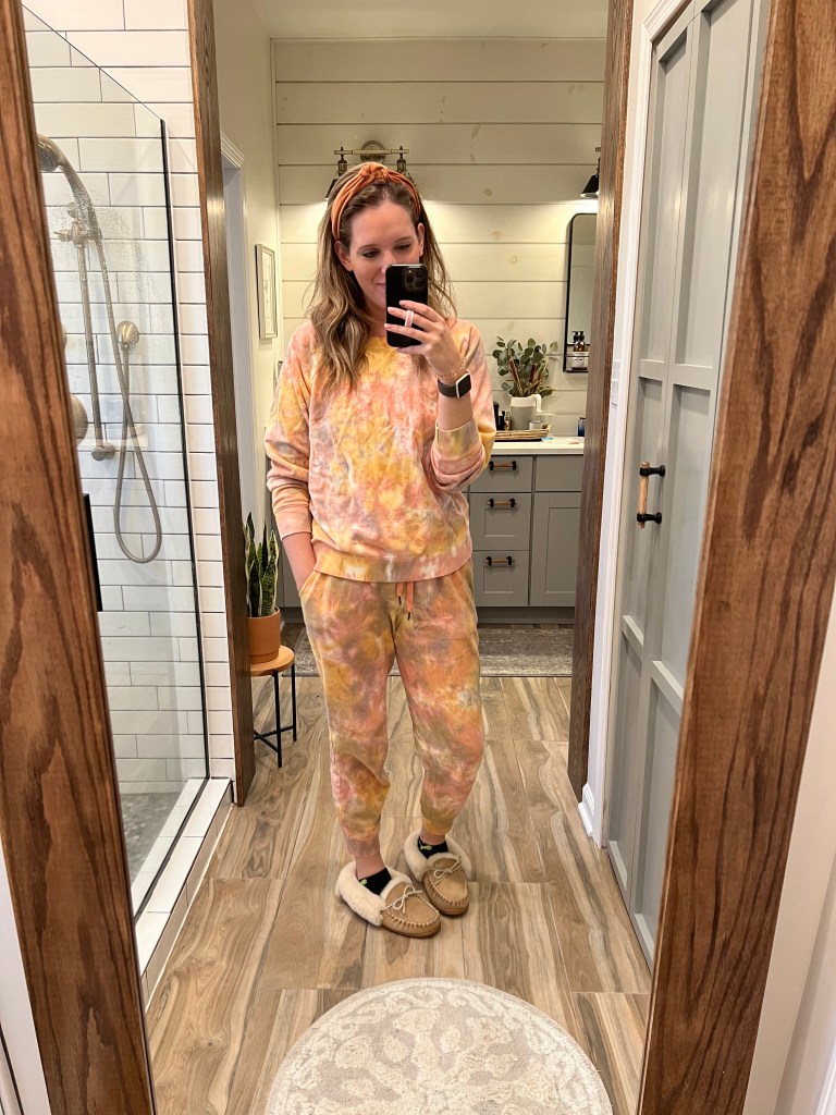
I actually picked this one up in the spring, but she’s still a fall hit. I just ordered it in warm tie-dye, so you know that she’s a winner. I mostly wear this around the house, but I’d be lying if I said I haven’t worn it to drop off my taxes, go to the grocery store, and hang out with friends. Ok, so basically I wear it out of the house a lot too. Whoops.

Brown Multi Tie Dye sweatshirt (link) and jogger pants (link).

I also have this in a sweatshirt linked here, color is Olive Tie Dye. Also sold as a crewneck here. And jogger pants linked here, color is Olive Tie Dye.

#5 – Luxe V Neck Long Sleeve & #6 – Rockstar High Rise Skinny Jeans

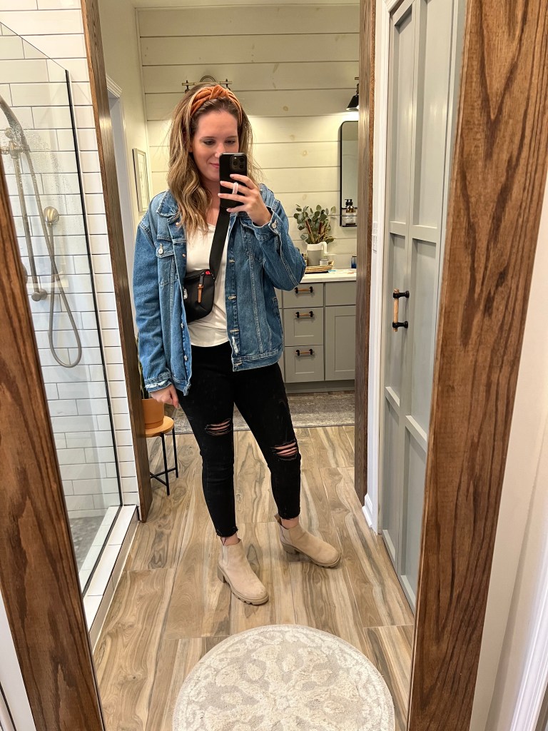
Every so many years I like to replace my luxe tees with new ones because the colors get faded and dingy. I love these shirts for layering, they’re flowy and don’t cling–plus they tuck nicely and the sleeves stay pushed up on the long sleeve.

Shirt linked here.

Another oldie but a goodie, I love my black high rise rockstar skinny jeans. The destroyed look in the knees makes them comfy and I can dress them up or down.

Similar rockstar jeans linked here.

And yes… that’s my oversized denim jacket (item #1) making another appearance. Hooray for versatility!

Let’s Wrap it up Cassidy

As you can see, I’ve linked a mix of new finds and similar finds to staples in my closet. You don’t need to reinvent your wardrobe every season (unless you want to, I reckon!) and investing in some key staples means you can mix and match new pieces over the years. Happy shopping!

xoxo,

Cass

Creating a Whole House Interior Paint Color Palette

Paint, you’ve got a lot of options. There’s infinite colors (literally, did you know you can create custom colors at most major paint companies?). Then mix in all the different colors every paint company sells. Sherwin Williams and Behr and Benjamin Moore and the list goes on and on and on. They all sell their own named colors (hint: you can get most colors color matched by any of their competitors).

The current trend is open concept houses–even if your house isn’t open concept, using a cohesive color scheme will make it feel more open because your rooms will flow more naturally into them. I generally like my entire house (including bedrooms and bathrooms) to feed into a color scheme because I can easily shift decor around rooms. I touched on this in last week’s post about color theory (linked here), but I like to work in analogous and monochromatic whole-house color schemes because it makes it easy to have color consistency. Some people like to make their main living areas all cohesive and express themselves differently in bedrooms. Pick what works for you!

A Special Note

First and foremost, I always feel you should not let paint colors dictate materials you’re buying. If you’re replacing your floors, pick your floors first. Floors are far more permanent than paint colors. Same goes for tile, cabinets, backsplash, and on and on. That being said, if you are keeping your existing materials you need to factor those in to the color making decision. If you have travertine tiles, you need to find a color that works with travertine. I have bone/almond color bathroom fixtures in my hall bathroom, I needed to find colors that worked not just use my favorite white that would’ve made the fixtures look dingy (and yes, there’s 1,000 shades of white so my walls are still a creamy white but not a bright white). If you’re rolling your eyes at me differentiating creamy white from bright white, you haven’t stood in a paint aisle weighing out all the shades ๐Ÿ˜‰

Why Create a Color Palette?

  • Easily intermix and change existing decor throughout your house (I’m a big fan of shopping your home, save money but feel like you’ve got a new space)
  • One palette means you can shop confidently knowing what goes and what does not — it also makes online shopping easier because you don’t have to be uncertain about if it’s the “right” shade to go with your 4,000 shades of green
  • Lastly… a cohesive color scheme will make your home feel cozy while still open concept (even if you’re just faking open concept! Yay open without knocking out walls).

Crafting a Color Palette

Ok so you want a color scheme, but where do you start? I have a few easy places to start to help you decide which color palette is a good fit for you.

Finding your Color Scheme

  • Scroll through Pinterest, look at your pins, look at the photos you’ve shared with friends as #goals… what are common colors you’re seeing throughout? Do you like bold colors everywhere? Light neutrals with pops of color? All neutrals everywhere?
  • Check out your wardrobe. You laugh, but a lot of the colors in my home are the same colors I enjoy wearing. Is your closet full of patterns? Are you only wearing neutrals, blues and greens like me ๐Ÿ˜‰ I’m not saying to turn your favorite shirt into a pillow to throw on the sofa, but just factor in which colors fit your vibe.
  • Use color theory (seriously… if this concept means nothing to you, check out my blog post on it (linked here), it will change your interior decorating game. I live in an analogous cool tones color scheme (blues/greens/yellows) and monochromatic (single colors) with tons of neutral colors added in
  • Recognize the colors already in your home. Do your wood floors have an orange tone? You’ll be in warm color shades. Are your cabinets blue? Plan for cool shades. Remember what I said above about planning based on what’s already in your home and staying, yes I meant it.

Find your White Paint Color

I start with finding a white (or a couple) as my base because there are so many shades of white. You’ve got warm whites, cool whites, bright whites, dingy whites, and there’s hundreds of them in that list. I like Sherwin William’s Alabaster because it’s a nice neutral color. It pulls slightly warm, which means in some homes with minimal natural light or warm white lightbulbs can cause it to read yellow. I also like Sherwin William’s Pure White as a truly white color, it doesn’t pull warm or cool, it’s the perfect shade of white to match any color palette. I’ve used Alabaster in my bedrooms and bathrooms and Pure White on all my trim, doors, detailed woodwork, kitchen cabinets, and hallways.

Find your Colors

Start Monochromatic

For example, when painting our house I knew I wanted a blue/gray color that would add “warmth” to my home. I chose Sherwin William’s Morning Fog as my base color. I used this color throughout my living room, dining room, family room and kitchen. All these rooms are connected with open doorways and the use of the one color connects them all. I wanted my laundry room and powder room to “go” with all the Morning Fog, but I wanted something lighter. I stuck within the color family and chose Reflection, which is a paler blue. I could’ve gone with Olympus White, which is two shades directly below Morning Fog, but I moved one shade over from Olympus White to get a color that brought in a slight bit more warmth. But my easiest recommendation when finding a monochromatic shade, is to choose one shade and work with the other shades that immediately surround it. See an example:

This is one paint panel, made up of Sherwin Williams Pure White through Crushed Ice. All these colors coordinate and play nicely together. You can repeat this process with any color. Say you want to find 5 shades of white that work well together. Or 5 shades of green. You catch my drift.

Get Analogous With It ๐Ÿ˜‰

So I started with Morning Fog and mixed in a lil’ Reflection (along with my Pure White in the main areas). When working on my hallway mudlocker/hot-mess drop-zone, I wanted to bring in another color, because I wanted the cabinetry to be it’s own standout detail in my otherwise white hallway — I went with green. I found a shade of green that has hints of blue and remains a cool shade, since all my other colors are also cool tones. I landed on Sherwin Williams Oyster Bay, and I honestly committed to it by holding the color chips together to see if it looked pretty (which I think it does ๐Ÿ˜‰ ) Sometimes the best thing to do is play with the online color picker or grab chips at the store, bring them home, and create combinations until you find one you like. This is what the Morning Fog panel, Pure White/Alabaster panel, and Oyster Bay panels all look like together:

All these colors play well together, because I’m not trying to introduce too many variations of green/blue/whites. All the colors in the green panel are rooted in the same shade of green, same for the blues, and the whites. It means they work together and don’t compete.

If you are going to add analogous colors into your monochromatic scheme, I recommend following my above suggestion of picking one color and using the shades that color surround that color. Otherwise you’re working in a LOT of tones to play with.

So You Want an Accent Wall?

I have 4 easy tips for picking an accent wall:

  1. Use the lightest shade from your monochromatic scheme
  2. Use the darkest shade from your monochromatic scheme
  3. For a light, neutral color room… use a dark, heavily saturated color (example: Sherwin Williams Crushed Ice paired with Sherwin Williams Tricorn Black as your accent)
  4. Pick a color that is complementary or split complementary to your base wall colors, aka opposite it on the color wheel (like red/green or green/purple/yellow). It’ll be visually pleasing and provide maximum contrast. This is the riskiest IMO because you’re introducing the most colors, but sometimes the riskiest gives you the biggest wow-factor.

Summary

Creating a whole house color scheme will create continuity through your home, allow you to make decor decisions confidently because you know what goes with which colors, and will give your house a more open concept feel. Rooms will flow more seamlessly together which will create harmony and balance. I recommend following a monochromatic/analogous color palette because you aren’t introducing too many colors. I also like mixing in a lot of neutral colors to help balance out colors.

At the end of the day you pick the scheme that works the best for you, that’s what makes your house feel like a home. Again, I would strongly suggest reading my color theory post (see here) for a background on how colors work together if it’s not something you’re familiar with. You won’t regret it ๐Ÿ˜‰

Understanding Color Theory for Home Decorating

I toyed around with a post talking about how to create a whole house color scheme, but I feel like you need a basis to understand how colors work together and which colors look nice together. So I promise, a post is coming for creating a color scheme, but first I want to provide some basics on color.

Getting Started

The color theory wheel is my favorite way to break down figuring out what colors look good together. If you find yourself frequently thinking, can I pair these two pillows together, this will help you ๐Ÿ™‚

Color Theory Wheel

Yep, I’m certainly throwing it back to ROY G BIV and elementary school primary/complementary colors. I personally believe making paint decisions ultimately comes down to a fundamental understanding of colors and more importantly, which colors look good together.

When I’m choosing paint colors (or really just mixing any colors, I personally believe the best options are analogous, monochromatic, complementary and triad.

Analogous Color Wheel

Analogous

Analogous color schemes are colors on the wheel that are next to each other. This is a very simplified display of analogous, but you’ll see the blue through yellow-orange are all colors that balance each other nicely and play off of cool and warm tones nicely. (Think fresh greenery, brass handles, blue textiles all mixed together.)

Monochromatic Color Wheel

Monochromatic

Monochromatic color schemes are using shades of the same color. Take the red slice for example, there’s shades of pinks all the way through to deep reds. You already know the color matches because it has the same base, it’s just playing on variations of the same (Think mixing red roses with blush peonies and pink carnations, they’re all pretty together color-wise because they’re rooted in red.)

Complementary Color Wheel

Complementary

Complementary colors are ones that compliment each other ๐Ÿ˜‰ They are colors that are directly across one another on the color wheel. They play off each other nicely because your eyes perceive the colors based on how rods and cones work (SCIENCE!). (Think Christmas with red and green or most sports teams, like my alma mater James Madison University mixing gold and purple as their university colors!)

Triad Color Wheel

Triad

Like complementary, triad colors are the three colors that form a triangle on the wheel (see orange-yellow, green-blue, and red-purple in the example). These colors play off of the warm and cool tones and like complementary colors, are visually pleasing to how your eyes perceive colors (MORE SCIENCE!) (Think greenery, brass hardware, and a pop of purple lavender.)

There’s plenty more options, but I don’t want to overwhelm you with split complementary, compound, square schemes and more (Adobe Color is a great resource if you want to visually see all of these combinations with colors you like)

What About Neutrals?

Neutrals are just that, neutrals. Whites, blacks, grays, creams, browns all can be shared across the color wheel. Sure… some neutrals might look better (I mean, I’m not jumping on the brown and red train any time soon ๐Ÿ˜‰ ) but go confidently mixing neutrals with any of your color schemes.

Applications of Color Theory in My Home

I mostly operate in analogous and monochromatic color schemes. I drift into complementary and triad when I’m adding in floral arrangements or mixing in artwork–basically when I’m wanting to put in a pop of contrast to the room. If you’ve seen my instagram (click here) you know that my happy colors are blues and greens mixed in with yellow (through brass) and combined with a ton of neutral. These are colors I like, they make me happy but feel calm and relaxed. So… you’re going to get a lot of examples of this which you can see through below!

Summary

Color theory isn’t hard, and once you know it, it’s pretty easy to apply regularly. I walk through stores and know pieces I’m mixing together work because I’ve got the wheel down pretty well (also, I don’t frequent the orange/red/purple side… so I can usually eliminate those options, haha).

My next post will be talking about creating a whole house interior color scheme, which can give anyone a more open concept feel!


-Cassidy

Let me know if this post was helpful by thumbs upping! And don’t forget to follow me on Instagram and Pinterest for more daily content ๐Ÿ™‚

Picking The Right Paint Finish for Every Room in Your Home

Paint is one of the most affordable ways to express yourself in your home. I love painting… to the point that people find it strange. I find it relaxing and love seeing a space change with a few hours of work and less than a hundred dollars (like, significantly less haha). My dad taught me how to paint, and he’s a jack-of-all-trades. Maybe I like painting so much because he taught me how to cut in a room without having to tape off a wall (I mean… does anyone really enjoy prep work?)

But today’s post isn’t about how to paint. Today we’re talking about the step before you even paint–when you’re standing at the paint counter looking deep into the soul of the 18 year old behind the counter asking you what finish paint do you want.

Skreeeeeech. Paint finish? I just spent the last 3 weeks committing to a paint color, now you’re telling me there are finishes?

Don’t worry, it’s not as scary as it sounds. And it won’t take 3 weeks to commit to a finish. I’m not a paint pro, but after painting every room in my home, and painting rooms at quite a few other houses (plus my dad’s infinite wisdom in my ear ๐Ÿ˜‰ ) I’m here to help you navigate the paint aisle so you can go from terror to purchase!

My Paint Brand Preference

I like Sherwin Williams paint. I love their colors and the numerous options they have for paint applications. However, if you don’t have a good ol’ SW nearby, don’t stress. Most paint brands have the same/similar finishes. (Side tip, most companies can color match any other companies paint colors. If it’s not 100% identical, it’s reallyyyyyy close.) I’ll try to make this cover 95% of the bases. We can’t all swing home runs all the time ๐Ÿ˜‰ Did I get that reference right? Anyway…

Picking Paint Finish by Room/Application

Can I use the same finish paint on all the walls and trim in my house? Sure. Should you… that’s a different story. I’ll give you my general rule of thumb, but you do you at the end of the day. Important note, there are 3 main items you are painting in these rooms:

Walls, Ceiling, Trim. Ok ya, this applies to any room so I won’t keep reminding you of these 3 things for every “room” we cover ๐Ÿ˜‰ What can I say except you’re welcome?

Main Living Areas

What do I mean by this. Quick rundown: a) Family/Living Rooms; b) Den; c) Kitchen; d) Playroom; e) Office; f) Bedroom.

Walls

Alright, walls. You probably have the most of these, unless you’re in a strange wall-less but ceiling and trimmed out room. Congrats, you have a wild home. For main living areas you’re looking for these finishes:

  • Flat/Matte
  • Eg-Shel/Eggshell/Low Luster/Lo-Lustre
  • Satin

These finishes go from less shine to slight shine as you move from flat through to satin. Flat paint can be the least forgiving, but you’ll have no shine. My main living areas in my home are painted flat. In my parents house, we picked an eggshell finish. The upside of eggshell and basically any paint that isn’t flat is that it can be easier to clean. I have dark walls and take a wet cloth to my walls to wipe them down, and I don’t have issues… maybe it’s that Sherwin Williams quality promise ๐Ÿ™‚

Ceiling

  • Flat

Do It, go flat. Trust me. Also, if you want white ceilings, pick the whitest color the brand has. In my house, we went with ‘Ceiling Bright White’. It’s pretty but doesn’t draw your eye up, which is what any plain ol’ painted ceiling should do in my opinion.

*Disclaimer, if you are doing a ceiling treatment, you might want a different finish. I’m talking about PLAIN OL’ CEILINGS โค

Trim/Doors

  • Satin
  • Semi-Gloss (the best choice, IMO)

My personal vote goes to semi-gloss. It’s easy to clean, but isn’t blindingly shiny. It’s a nice appearance for the detailed pieces of the room, while differentiating between your walls.

Bathrooms

Bathrooms have moisture. (Yes thank you Cassidy for that infinitely wise piece of information. You have forever changed my world). Bathrooms that are poorly vented, don’t have fans, or where you don’t keep your window open can get weird water runnies on your walls (wipe those off, please. For the love of your sheetrock and just cleanliness). Because of this, you want to take your paint finishes into consideration differently here.

Walls

You’re best bet for bathroom walls is:

  • Eg-Shel/Eggshell/Low Luster/Lo-Lustre
  • Satin (my personal preference)

Satin is more durable than eggshell, and it’s velvet-like finish will work perfectly for your moisture heavy bathroom. You’ll be able to wipe your walls down without creating weird sheens in the paint.

Ceiling

Ceilings are another space to choose between:

  • Eg-Shel/Eggshell/Low Luster/Lo-Lustre
  • Satin

I like eggshell, because I like the less shine look (notice how I picked flat for regular living areas, I don’t like shiny ceilings), but satin won’t steer you wrong.

Trim/Doors

For bathroom trim, you’ve got:

  • Satin
  • Semi-Gloss (the best choice, IMO)

Just like your regular living areas, I still vote semi-gloss. It’s easy to clean, you can wipe off hair (or dog fur in my case regularly) and it cleans up nicely which dust can collect quickly from all that shower moisture.

Summary

When in doubt, ask. I still check with my Sherwin Williams pals at my local store when I’m painting something different if the finish I’m thinking of makes sense. They’re super nice, and you can always ultimately pick what you want. You’re the captain now!

Paint finishes can come down to preference. You might have read this and went “ew Cassidy, I ALWAYS paint my trim in gloss”. To you I say, you go Glen Coco! You might be doing a board and batten wall treatment and want to paint all of that in a semi-gloss to go along with your trim. Or you’re painting a dark moody wall, and you want the wall and the trim to be the same color with the same flat finish. This is a baseline guide, but play with finishes as you try new things.

Like I said, paint is one of the cheapest ways to quickly redo a room (well… maybe not cheapest if you are hiring out). But now that you know which finish to use, pick out a color, grab a brush and roller, and bust out a wall. You might just love what you try ๐Ÿ™‚

If you think this guide is missing something, let me know in the comments. And speaking of comments… I’d like to know if you think a post on how to a paint a room would help. I’ll give you some of my dad’s best kept secrets ๐Ÿ˜‰

My 5 Favorite Grove Collaborative Products

Iโ€™m sure youโ€™ve heard of Grove Collaborative by nowโ€”but if you havenโ€™t, itโ€™s a company that allows you to purchase cleaning products, accessories, and personal care items online and have it shipped right to your home. You can use Grove for free, or you can become a VIP for $20 a year and unlock VIP discounts, promotions, and gifts.

Iโ€™ve been a Grove VIP member since 2019, and thereโ€™s no looking back. I love having monthly subscriptions come right to my home, Iโ€™m a sucker for free gifts throughout the year (I mean who doesnโ€™t love feeling appreciated ๐Ÿ˜‰ ) AND theyโ€™re a company that strives for sustainability AND they pledge to be plastic free by 2025. Youโ€™ve hit a trifecta for me.

Without further ado… Iโ€™m sharing my top five favorite Grove Co. brand products sold through Grove Collaborative that I use on the regular.

Grove Co products in a flatlay
How does one display products prettily? Flatlay it is.

Grove. Co Brand Favorites

1. Walnut Scrubber Sponge

I love these sponges (see here) because theyโ€™re pretty to look at and arenโ€™t full of chemicals. The scrubber side is made of walnut shells and recycled plastic, the sponge side is 100% plant-based cellulose. I can scrub tough grime and the sponge doesnโ€™t get a gross-chemical smell overtime. They come in a pack of 2, so Iโ€™m always ready when itโ€™s met its end and I need a new one!

2. Hydrating Hand Sanitizer Duo

This hand sanitizer (see here) makes me feel safer in a world of COVID, and it smells great! I donโ€™t like chemical smellsโ€”oh, you didnโ€™t notice that theme based on my love of their sponges ๐Ÿ˜‰ โ€“ but I want to know that my hands are clean. This sanitizer goes on great and dries quickly, so I can get back to whatever I was doing without leaving alcohol streaks all over. I like the duo, because itโ€™s nice to have some ready in my car and my purse, but you can always purchase them individually whenever you run out!

3. Daily Shower Cleaner Concentrate with Glass Spray Bottle

Our master shower has a giant glass doorโ€”combine that with our hard well water, and it gets gunked up. I dump the concentrate into the spray bottle (see here), fill the rest with water, and leave it in our shower. Itโ€™s so easy to use, even Ryan uses it. We just spray it on all the glass and shower fixtures after every use and walk away! I love products that donโ€™t require a lot of effort, and this fits the bill. The Orange and Rosemary scent is my favorite, it’s light and clean!

4. Clean Minute Washing Machine Cleaner Set

We have a front load washer, and if youโ€™ve ever owned one you know they can get a gross mildew smell. Who wants to wash their clothes in that? This cleaning set (see here) means you don’t have to. I do a quick mist on the drum after every wash and use the microfiber towels with the spray to wipe down the rubber door seal every week. It gets out the smell (and forces me to clean out the dog fur and gunk that builds up!)

5. Makeup Remover Towel

Want a sustainable way to remove your makeup without using a disposable towel full of chemicals? I love this towel (see here), I use it every night to take up my makeup–and yes, it even gets my mascara off! and once I run out of clean sections to use, I toss it in the washer and dryer! (If you are someone who throws your washcloth in the wash after a single use, I applaud you… but also, don’t judge me ๐Ÿ˜‰ ) It comes out clean and ready to goโ€”and sustainable! I swear by these so much I travel with them and have backups ready to go in case I forget to strategically avoid doing laundry to binge Outlander.

But wait… there’s more!

Grove Collaborative also sells other brand products. WHAATTTT. They source other companies that also have sustainable, earth-friendly initiatives and package it right alongside your Grove Co. products in your monthly order. These products include self care, makeup, vitamins, pest killers, and more. I couldn’t do a post about Grove without also talking about some of my other favorite products to buy through Grove.

Mrs. Meyer's Toilet cleaner, Caldrea counter spray bottle, and Beauty By Earth 3-Piece face wash set

3 More Favorites Sold on Grove

1. Mrs. Meyerโ€™s Toilet Cleaner

Toilets are gross. Literally. I hate cleaning them but know itโ€™s a necessary evil. I love this toilet cleaner (see here) because it takes out a lot of the hard scrubbing, and has a clean, non-chemical smell (see the trend continues). I prefer the Lemon Verbena scent because I do not like the smell of any lavender, but pick your favorite!

2. Caldrea Countertop Spray

I like this spray (see here) for regularly cleaning my bathroom counters. It wipes away clean without streaks, and leaves the great scent for hours! Sea Salt Neroli is my favorite sent; it smells heavenly.

3. Beauty By Earth Face Wash, Toner & Moisturizer Set

I have sensitive, combination oily skin, and this face wash set (see here) keeps my face clean and breakouts to a minimum! It comes individually, in case you use some products faster or slower, but I love using these morning and night. I also use the toner to set my makeup and throughout the day to dry out my oily skin!

Summary

Iโ€™m a big fan of Grove Collaborative, and Iโ€™d tell anyone who hasnโ€™t to at least try it! If you use my referral link youโ€™ll receive a free gift set on top of your order! Who doesnโ€™t love free stuff?!

If you decide to try any of these products, Iโ€™d love to hear about it in the comments!

Installing A Marble Backsplash

Now that our kitchen renovation is complete, I thought I’d do the totally logical, well thought out thing thing I do best, scramble to find photos of what I documented and give you a guide ๐Ÿ™‚ We went with a marble backsplash in our kitchen during our recent reno. It’s beautiful and fabulous, and not temperamental at all… wait scratch that. Marble is a little picky. It’s kind of like your curly haired friend who doesn’t like to go out when it’s too humid, or her hair will turn into a frizzball–oh you don’t have that problem?

Must be nice ๐Ÿ˜‰ Since what you really came here for is a guide to installing backsplash, I’m going to start by telling you what we used to install ours, and then talk install.

What to Buy

  1. Tile – (see ours here) – We bought 3×6 honed marble tile from Floor and Decor. It’s beautiful and I love it, but like all marble, be prepared for variation in every single piece
    • TIP: We like Floor and Decor because they provide a handy square footage calculator for the specific tile you are looking at. We always recommend rounding up at least 10% more than you believe you’ll need (although I frequently jump to 15%, you can always return extras to them!)
  2. Tile Adhesive – (we used this) – We like tile adhesive for wall applications, it’s a bit firmer so your tiles won’t slide down the wall while the mastic takes time to dry
  3. Grout – (see ours here in the color Avalanche) – This unsanded grout is perfect for wall applications when your grout lines are 1/2″ or less
  4. Unsanded Caulk – (we used this in the color Avalanche) – Match your caulk color to your grout, and use this to caulk between your tile and counters, and tile and cabinets
  5. Tile Sealer (we used this) – DON’T SKIP THIS but seriously, don’t. We sealed the tile before we stuck it to the wall and after we grouted. Marble likes to soak in water, and it’ll soak in all the water in the mastic and your grout color. This will save you. And down the road, it’ll save you from spaghetti sauce splashbacks!
  6. Tile Spacers – (we used these for the first row off the counter, and we used these for the rest of the grout lines) – Buy the spacers and use them, trust us. You might think you can “eyeball” it all, you can’t, and your tiles will be a giant wave across the wall
  7. Wet Saw – Rent one from a home improvement store or purchase one, but we definitely recommend this over the dry tile cutters
  8. Sponges and Rags – Great for cleaning up grout and applying/removing tile sealer
  9. Trowel – Use a notched trowel for your specific tile size and thickness
  10. Rubber Grout Float (like this one) – you’ll need this to apply your grout without damaging your tile
  11. Outlet Extenders (we used these) – this will let your outlets be flush with the tile, and will stop them from “rocking” by being secured to the electrical box. We like this kind because you can click together the spacers to make them as thick or thin as you need based on your tile adhesive and tile thicknesses

Prep your Marble Tile & Pattern

Prep The Tile

Use your tile sealer, we used Impregnator-511, and seal all your individual tiles. Doing it from the start will protect your tile from: 1) water staining from the wet saw when making cuts; 2) tile adhesive water soaking into the tile; and 3) grout color being absorbed into the tile.

Prep The Pattern

Typically, even when you buy the same cases of marble tile, it’s still going to have a lot of color and pattern variation. You’ll want to “plan” your tile so that you don’t end up with a ton of white tiles on one side and gray on the other. Trust me, plan.

Here’s how I planned ours. First, I sorted through all my sealed tiles and stacked them with like colors and patterns. It boiled down to these 8 categories (have more, or less, just have something)

White White with Veining
Light Gray Gray with Veining
Dark GrayDark Gray with Veining
CreamCream with Veining

We settled on a brick pattern for our tiles so I set to work laying them out on the counter to plan for how they should go on the wall.

You can see the brick pattern, my piles of color separated tiles and the beginning of the pattern. You want to “randomly” place tiles so you don’t have too many of the same color/pattern tiles next to each other. Ryan loved this method, because it meant I wasn’t handing him tiles to put on the wall and then stepping back and saying “WAIT, that one can’t go there, there’s too many grays!!!” LOL.

Now that you’ve planned, it’s time to install it’s time to PREP. We used blue painter’s tape to tape red rosen paper to our counters (you can also use thick plastic). Tile adhesive and grout are a beast to get off your counters, so cover those babies up and thank me later. Now… drumroll… we tile!

Installing the Tile

When doing a brick pattern, you’ll want to start at one side of your counters. Don’t start in the middle, it’s just going to make it complicated. We like to put full tiles at the bottom, against the counters, and leave the cuts for the top against the cabinets. To me, this looks best because you’re only going to see up against the cabinets if you’re under 3 feet tall (aka kids, and they don’t care) whereas you’ll see against the counters every day. We started with a full tile on the bottom row, which meant the second row would be a half tile, third row a full, and repeat.

3 Quick Thoughts on Using a Wet Saw

  • Most importantly, if you are not comfortable using a wet saw. Don’t. Find someone who is or someone who will teach you to use one (or even YouTube it!). A wet saw is a power tool, and we don’t take power tools lightly around here.
  • Wear an apron or jacket you don’t love. (Or if you’re me, cut up a trash bag and wear it as a protective suit). Lots of water is going to splash up on you, this will keep you dry longer.
  • Wear eye protection.
It me. Trash bag and goggles is the new fashion trend.

Tips for Install

  • Follow the directions on your tile adhesive — and use a notched trowel to apply the adhesive.
  • Maintain a consistent depth for how far you’re pushing your tile into the adhesive, otherwise you’ll have some tiles sticking further back than others, which gives a wonky look and will make grouting harder. Boo to that.
  • Use the spacers, seriously. That wasn’t just something I lightly suggested to buy. Do it!!! ๐Ÿ™‚
  • Don’t put adhesive on your entire wall at once, we went about 6 tiles ahead (approximately 3 feet) so that it wasn’t drying too fast, and we could scrape it off if we ran out of energy and wanted to stop tiling for the night.
  • Use a graphite pencil to mark on your marble tile where you need to make cuts. Markers and pens will bleed into the marble. Learn from our mistakes.
  • Hang on to scrap cuts, you never know when it will come in handy for a partial piece down the line.
  • Continue the pattern around corners. We got lucky, and our pattern literally continued with the full/half/full repeat at the corner, but if not, continue the pattern. If you end up with a partial tile on one side of the corner, use the remainder of that cut piece to continue the pattern onto the next wall. See below!
That corner wrap though ๐Ÿ˜‰

Tips for Grout

  • We used a pre-mixed grout, it saved us time and energy (and only cost a little more).
  • Use an unsanded grout if your grout lines are thinner than 1/2″. It’s easier to apply and clean off.
  • Use a rubber grout float, and apply the grout at 45 degree angles to the tile. This will prevent you from chipping corners of the tile and will ensure your grout is spread evenly through the grout lines.
  • Follow the instructions for how long to let the grout set in the tile and then wipe it off thoroughly. We used 3 sponges so we had a constant rotation of one being used, one being cleaned, and one ready waiting. You only get about 3 swipes per side of the sponge (6 total) before it needs to be washed off, so make those swipes count!

Done? NO!

Your outlets need to be flush with the tile which is now significantly thicker than your pre-backsplash life. You’ll want to use outlet extenders to make the tiles flush while still allowing them to be secured to the electrical box. If you do not do this step, your outlets will “wiggle” and you are creating an electrical hazard!

Marble tile also needs to be sealed. Use the same tile sealer you used to seal your tiles when you prepped. Seal your tile and plan to have to clean and reseal it every year. We just followed the instructions on the box, 10 minutes tops – easy peasy. It’ll keep those beauties looking as good as the first day you installed ๐Ÿ™‚

Our Backsplash

Now for the best part. Results pictures! One last quick look at the before:

And the after!

Total Cost Breakdown

  • Tile (36 sq. ft) – $298.42
  • Tile Adhesive – Leftover from a previous project
  • Grout – $44.99
  • Tile Sealer – $29.27
  • Spacers – $10.96
  • Caulk (2 tubes) – $15.00
  • Sponges – $3.94
  • Outlet Extenders – $7.98
  • Wet Saw – borrowed
  • Notched Trowel – borrowed
  • Rubber Grout Float – borrowed
  • 1 Trash Bag Protective Suit ๐Ÿ˜‰ – $0.01

Total = $410.56 & Project Time = 1 Weekend

Summary

What do you think? And would you tackle a project like this? I’d love to hear in the comments below!

Introduction Post (the awkward content you never knew you wanted)

I’ve started this sentence at least a dozen times. In my head I just keep thinking “this is awkward” over and over again. As someone who doesn’t journal, let alone share long, witty posts across the interwebs… this is my awkward. I’m more comfortable on Instagram stories, where I can share quick 10 second peeks into our life. Better yet, I’m most comfortable binging Outlander or reading the entire Virgin River series ๐Ÿ˜‰ However, this year (and one graduate marketing class later) has pushed me to finally start what I’ve thought about starting for the last year.

I’ve been sharing our life since 2017 on Instagram. And it’s been a journey–buying a house, finishing grad school, marrying my best friend, rescuing two dogs. Our house is probably the biggest journey. In case you haven’t seen the ‘before’s’ of our house… I present to you a smattering of teal, pink, and not so much my style.

I forgot to mention burgundy. The burgundy bathroom nightmares are made of. These are all the listing photos, and at this point, we’ve changed something in every room in our home. We’ve spent a few years picking up new tricks, trying out many DIYs, and learning to make this house a home. I love sharing our home, and I also love when people ask me for ideas of what to do in their house. So I’m taking the plunge, and sharing DIYs, home decorating, and lifestyle ideas that come straight from our regular lives. If you like decor, projects, recipes, clothes styling, and guest appearances from Ryan, then you’ve made it to the right place!

I’m no expert, but I’d love to share a piece of our life in a space more permanent than a 10 second Instagram story. So… here I am! I’ll be revisiting old projects and taking you along with new ones. I hope you’ll stick around for more awkward than ever before


xoxo, Gossip Girl – Cassidy