I toyed around with a post talking about how to create a whole house color scheme, but I feel like you need a basis to understand how colors work together and which colors look nice together. So I promise, a post is coming for creating a color scheme, but first I want to provide some basics on color.
Getting Started
The color theory wheel is my favorite way to break down figuring out what colors look good together. If you find yourself frequently thinking, can I pair these two pillows together, this will help you 🙂
Color Theory Wheel
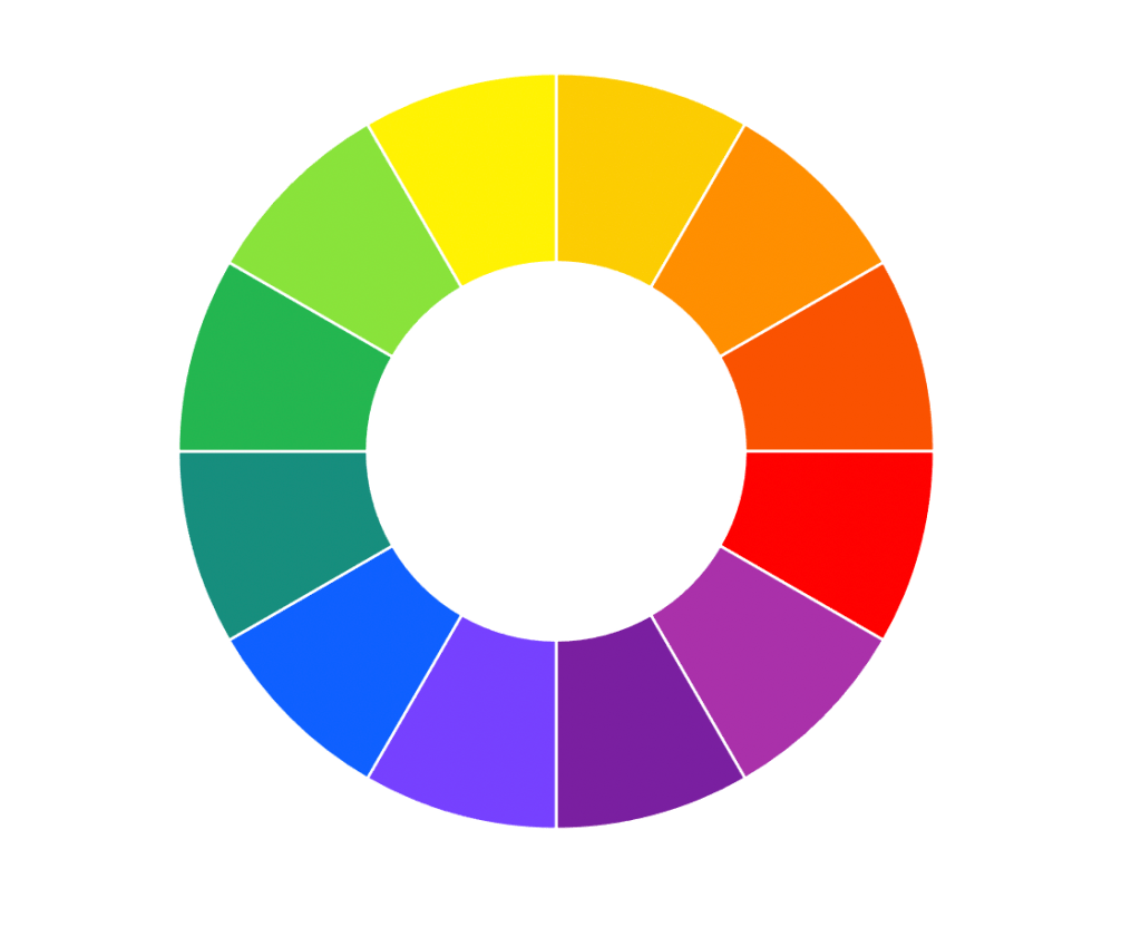
Yep, I’m certainly throwing it back to ROY G BIV and elementary school primary/complementary colors. I personally believe making paint decisions ultimately comes down to a fundamental understanding of colors and more importantly, which colors look good together.
When I’m choosing paint colors (or really just mixing any colors, I personally believe the best options are analogous, monochromatic, complementary and triad.

Analogous
Analogous color schemes are colors on the wheel that are next to each other. This is a very simplified display of analogous, but you’ll see the blue through yellow-orange are all colors that balance each other nicely and play off of cool and warm tones nicely. (Think fresh greenery, brass handles, blue textiles all mixed together.)
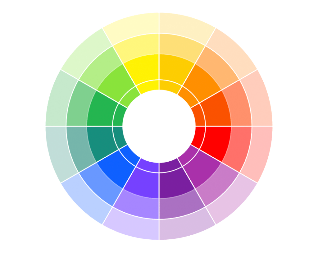
Monochromatic
Monochromatic color schemes are using shades of the same color. Take the red slice for example, there’s shades of pinks all the way through to deep reds. You already know the color matches because it has the same base, it’s just playing on variations of the same (Think mixing red roses with blush peonies and pink carnations, they’re all pretty together color-wise because they’re rooted in red.)

Complementary
Complementary colors are ones that compliment each other 😉 They are colors that are directly across one another on the color wheel. They play off each other nicely because your eyes perceive the colors based on how rods and cones work (SCIENCE!). (Think Christmas with red and green or most sports teams, like my alma mater James Madison University mixing gold and purple as their university colors!)
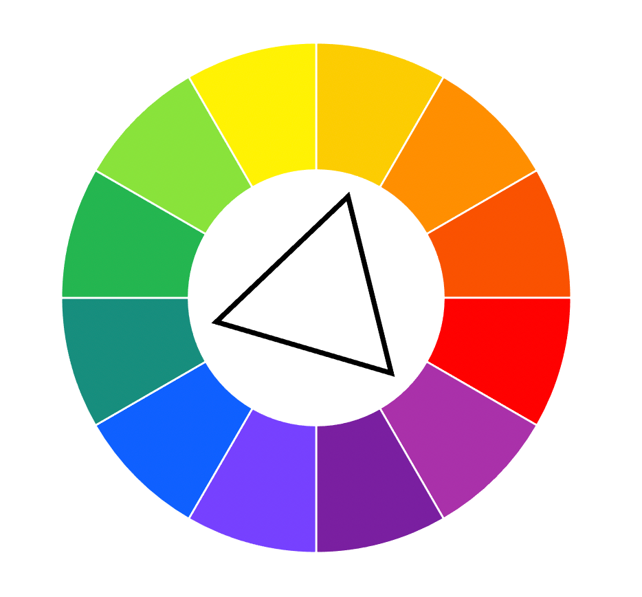
Triad
Like complementary, triad colors are the three colors that form a triangle on the wheel (see orange-yellow, green-blue, and red-purple in the example). These colors play off of the warm and cool tones and like complementary colors, are visually pleasing to how your eyes perceive colors (MORE SCIENCE!) (Think greenery, brass hardware, and a pop of purple lavender.)
There’s plenty more options, but I don’t want to overwhelm you with split complementary, compound, square schemes and more (Adobe Color is a great resource if you want to visually see all of these combinations with colors you like)
What About Neutrals?
Neutrals are just that, neutrals. Whites, blacks, grays, creams, browns all can be shared across the color wheel. Sure… some neutrals might look better (I mean, I’m not jumping on the brown and red train any time soon 😉 ) but go confidently mixing neutrals with any of your color schemes.
Applications of Color Theory in My Home
I mostly operate in analogous and monochromatic color schemes. I drift into complementary and triad when I’m adding in floral arrangements or mixing in artwork–basically when I’m wanting to put in a pop of contrast to the room. If you’ve seen my instagram (click here) you know that my happy colors are blues and greens mixed in with yellow (through brass) and combined with a ton of neutral. These are colors I like, they make me happy but feel calm and relaxed. So… you’re going to get a lot of examples of this which you can see through below!

Monochromatic with Orange Contrast 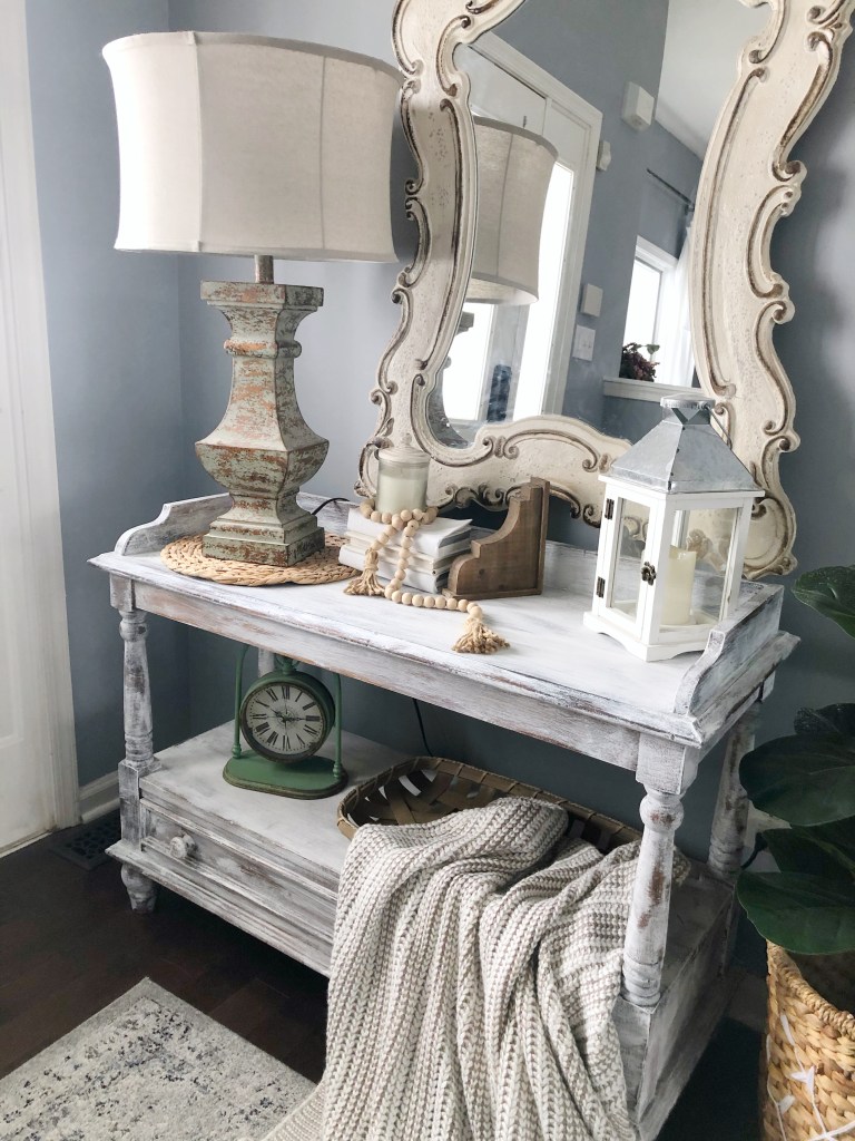
Analogous Cool Tones 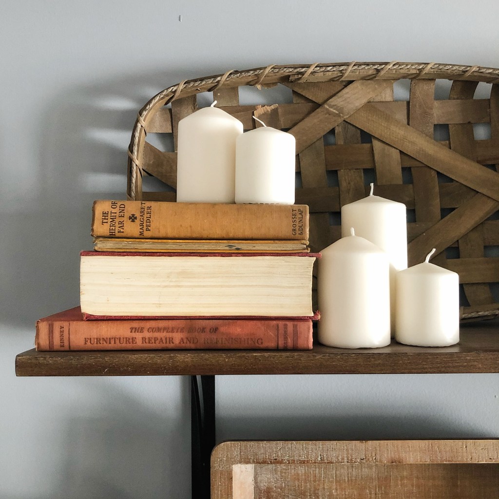
Analogous Warm Tones 
Complementary Green and Pink Mixed with Analogous Cool Tones 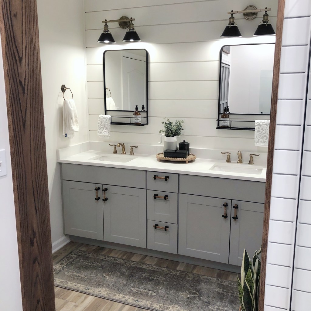
Monochromatic Neutrals 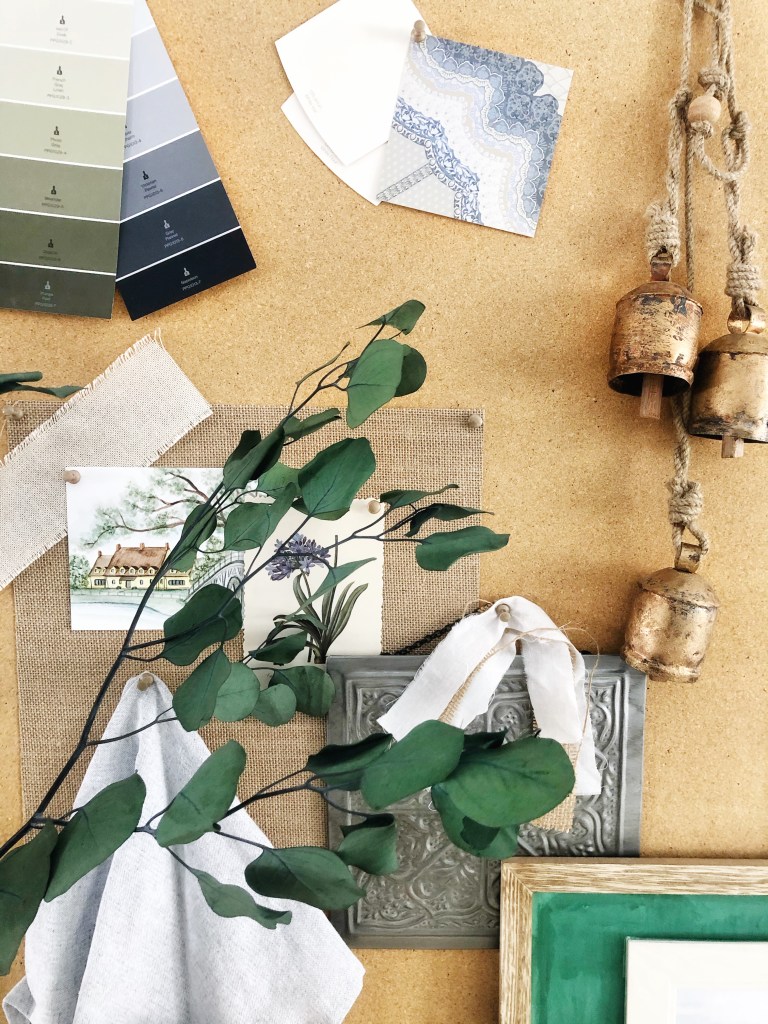
Analogous Cool Tones 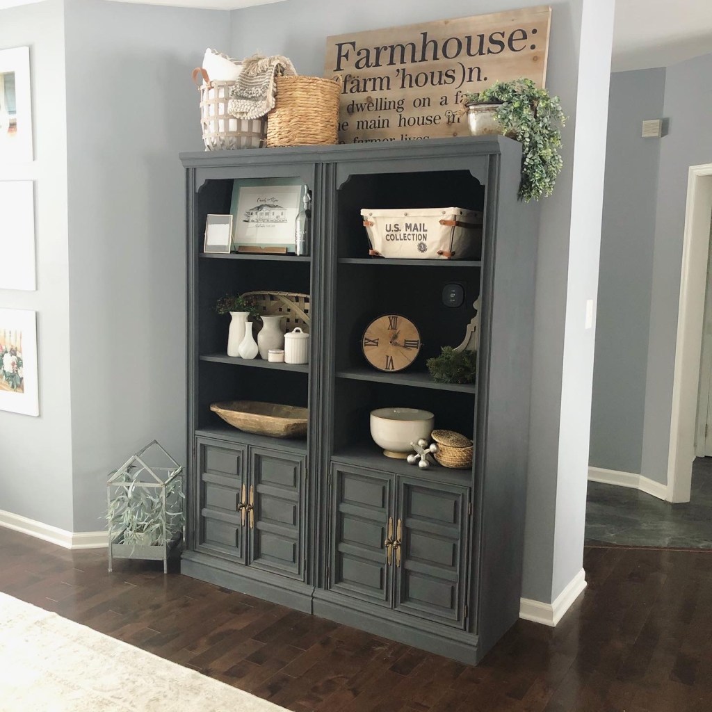
Analogous Cool Tones 
Monochromatic with Green Contrast 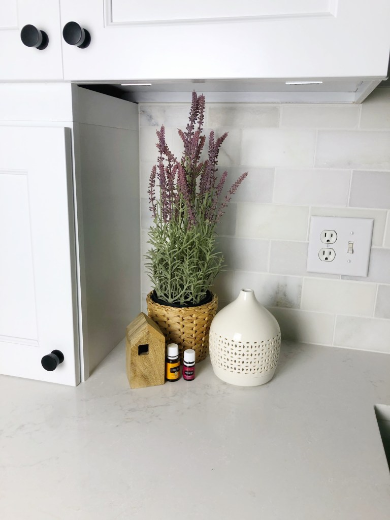
Triad (Orange, Green, Purple)
Summary
Color theory isn’t hard, and once you know it, it’s pretty easy to apply regularly. I walk through stores and know pieces I’m mixing together work because I’ve got the wheel down pretty well (also, I don’t frequent the orange/red/purple side… so I can usually eliminate those options, haha).
My next post will be talking about creating a whole house interior color scheme, which can give anyone a more open concept feel!
